


Color theory has long maintained that certain colors are linked to certain moods. Whether this is universally true or a byproduct of cultural expectations about the meanings of those colors is still up for debate, but one thing that is not debatable is the fact that research shows these effects are perceived by those who have to use the space. They are reproducible as well, so you know that they will be predictable in their results.
Since moods have been linked to stress levels and stress levels have been linked to the likelihood of coping well with adverse conditions like sickness. High stress levels have even been linked to the onset of new disorders, so anything you can do to lower stress in recovery spaces will be beneficial. Before you decide on the right shades for your healthcare curtains and other facilities, you need to consider two factors: color intensity and the meanings of color choices.
There are a variety of well-established meanings for each color, so there is not one right or wrong choice, and blended colors will evoke the characteristics of both of their parents. For example, an aquamarine shade will bring some of the feelings associated with blue and some of those associated with green. Use the meanings associated with common colors to help you select the exact right shade for your facilities:
Using these color meanings, it is easy to see how you can create various moods for various patient areas, depending on the level of privacy, the goals of the area, and the overall mission of your facility. Combining colors with patterned choices can also be a great way to reinforce moods and to create synergistic energy in spaces. While that is exciting, it’s also important to remember your goals and to avoid overwhelming people with too much sensory information. That means limiting the way color combinations work and making them intentionally. It also means understanding what color intensity does for the energy of spaces.
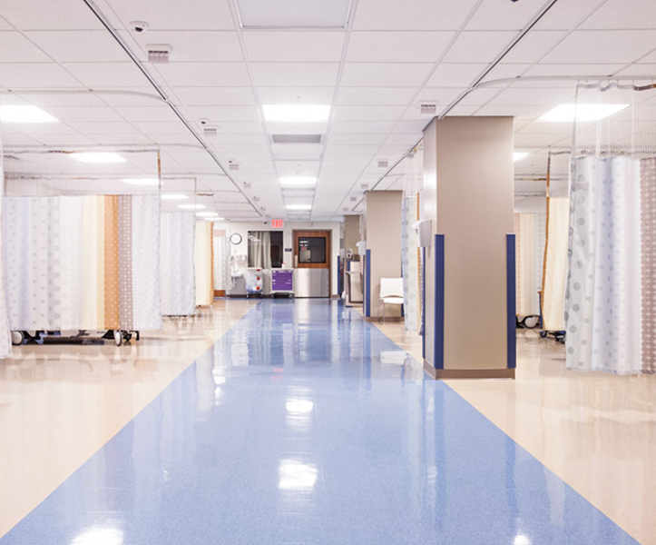
Once you understand the basic meanings of colors, you also need to realize that high intensity color tends to bring out the most energetic and highest form of that color’s meaning. It also tends to grab the attention of the person looking at it, so it can be easy to overwhelm people by placing a high-intensity color as an accent wall if the patient is going to be facing it all day. You want to save those intense and energetic colors for places where their energy works, like high traffic areas.
Matching the color and intensity to the space allows you to create happier, more welcoming environments for patients because the color choices will reflect the context of the room’s design. The result is a kind of harmony that may be subtle, but that has real effects on the mood of the patient. These choices have already been well-documented by psychological researchers, both generally and specifically in the healthcare field. Next time you need to order supplies for your facility, keep these ideas in mind so you can plan your choices strategically.